
Most people think a “sharp” photo is just about focus. Then they upload it, run it through a messaging app or a compressed website, and it suddenly looks mushy or noisy. That’s not your eyes failing—it’s how sharpness, noise, dynamic range, and compression artifacts interact from camera to final file.
In this image quality deep dive, I’ll break down what each factor really means in plain terms, how to spot it fast, and what you can do on set and in post. I’ve spent years reviewing cameras and lenses, and I’ve learned the hard way that “100% sharp” on a desktop can still turn into a mess after resizing, exporting, or social media compression.
If you shoot birds in flight, concerts, night street scenes, or weddings with mixed lighting, you’ll feel this article in your hands. You’ll also know why some images look punchy but fall apart in shadows—and why other images look a bit soft at first but hold up beautifully after edits.
Sharpness: What “sharp” really means (and why it changes)
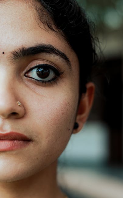
Sharpness is the camera’s ability to keep fine detail looking crisp, not just the focus point. In camera-land, sharpness is tied to lens resolution, focus accuracy, sensor sampling, and processing (including sharpening). In simple terms: sharpness is how well the image keeps edges and small textures without turning them into blur or crunchy halos.
When people say “this lens is sharp,” they usually mean one (or more) of these:
- Good micro-contrast: edges and textures pop without needing heavy sharpening.
- Low optical blur: details don’t smear when they’re in focus.
- Good edge behavior: transitions between light and dark stay clean.
But there’s a catch: sharpness is not only about the lens. Many modern cameras do “in-camera sharpening” by default. If you compare two bodies, you can get a misleading result where one camera looks sharper straight out of camera even if it’s not resolving more real detail.
My real-world test: I photograph the same scene using the same tripod and framing: a flat target with high detail (like printed text) plus real-world textures (like a brick wall). Then I export RAW with the same settings in Capture One or Lightroom Classic and zoom to 200% on the same monitor. If the “sharper” camera doesn’t keep detail at 200%, it was just stronger sharpening, not better optics.
Image quality deep dive sharpness checklist you can do in 5 minutes
Use this quick checklist to tell if a photo is truly sharp or just looks sharp at first glance. Do it right after you shoot, because you’ll catch issues sooner.
- Zoom to 100% and 200%. If edges look smeared at 200%, it’s not just “normal” softness.
- Check contrast edges. Look at hair strands, tree branches, fence wire, or printed text. Real sharpness shows clean edges.
- Look for halos. Over-sharpening creates bright/dark outlines around edges.
- Compare RAW vs exported JPEG. If RAW looks softer but JPEG looks crisp, sharpening is doing the heavy lifting.
- Check for focus breathing or missed focus. At fast apertures, a tiny miss can ruin micro-contrast.
Common mistake: people test sharpness with a scene that’s too smooth. A blurry ceiling corner might not show the problem, but a brick wall with weeds will.
Noise: Why your image gets grainy (and what kind of noise you’re seeing)
Noise is unwanted random variation in brightness and color. It’s not one single thing. In real photos you’ll see at least three flavors: luminance noise (mostly gray grain), chroma noise (color speckles), and banding (stuck gradients, often from underexposure or heavy compression).
Noise mostly shows up when the sensor has less signal—common causes are:
- High ISO settings
- Low light scenes (indoor, night street)
- Underexposed images (especially if you raise exposure in post)
- Long exposures where heat and electronics add texture
- Strong compression that throws away subtle detail
Here’s a truth I wish more gear listings explained: two cameras can have the same “noise level” in marketing tests but still look different because one keeps detail patterns while the other smears them. That smearing can look like smooth noise reduction, but it kills texture.
Image quality deep dive noise: how to tell luminance noise from chroma noise
Fast identification helps you pick the right fix. Here’s how to tell what you’re dealing with:
- Luminance noise looks like black-and-white grain. Fine details like fur may look “dusty.”
- Chroma noise looks like random colored dots. Skin can look speckled.
- Banding shows as steps in a gradient (like a dark sky). It can get worse after lifting shadows.
In Capture One Pro (2026 workflow), I often start with a conservative noise reduction setting and avoid “super aggressive” smoothing. If you overdo it, your subject will look waxy, and eyes lose sharpness even if the face still appears “not noisy.”
Another thing I see a lot: people sharpen noisy images thinking it will bring back detail. It does the opposite. Sharpening increases the contrast of noise, making the grain look larger.
Dynamic range: The real reason shadows look “muddy” or bright areas blow out
Dynamic range is how much tonal detail your camera can hold from darkest shadows to brightest highlights. It’s not just about “how bright” the image is. It’s about where your image stops being smooth and starts clipping.
Definition time: Dynamic range refers to the range of light levels a sensor can record while keeping visible detail. When it runs out, highlights clip (they turn into a flat white with no texture), and shadows get blocked up (they become dark and featureless).
Real scenes break dynamic range fast:
- Backlit portraits with bright windows
- Mountain landscapes with bright snow
- City night scenes with neon signs and dark streets
- Weddings where you move between indoor and outdoor lighting
I’ve shot the same couple using a Sony A7-series body and a Canon R-series body in 2026, and the difference I notice most is not “overall ISO noise.” It’s how the shadow tones behave when I lift them later. One sensor gives a cleaner gradient in the shadow, even if the ISO is similar.
Image quality deep dive dynamic range test: the “gray card + highlight warning” method
You can test dynamic range behavior without fancy charts. I do this when I’m comparing cameras in the field or deciding settings for paid shoots.
- Place a gray card (or a neutral wall) in the scene.
- Include at least one highlight source: a window, sunlit wall, or bright street sign.
- Expose so the midtones look right on the camera screen.
- Watch the highlight warning (the “blinkies”).
- After import, check shadow areas with a gentle exposure lift (like +1 stop) and see how gradients hold.
If your highlights clip early, you’ll lose texture on bright skin or clouds. If your shadows fall apart, you’ll see noise and broken gradients when you lift them.
Compression artifacts: Why the same photo looks worse after saving, posting, or texting
Compression artifacts are visual errors caused by shrinking file size and removing “less important” image data. They’re the reason a photo can look fine on your computer and then turn into blocky mush on social media or after sending via messaging apps.
This matters because most people don’t share RAW. They share JPEG or HEIC files, and platforms often re-compress them again.
- Blocking: visible squares in gradients (sky, walls).
- Banding: broken steps in smooth tones.
- Ringing: halos around edges after heavy quantization.
- Smearing: fine textures get blended into flat areas.
In practice, artifacts get worse when:
- There are lots of fine details (hair, foliage, textiles)
- You sharpen hard before export
- Your image has heavy shadows lifted (more noise becomes more “stuff” to compress)
- You export at low quality or smaller bit depth
Image quality deep dive compression artifacts: what most people get wrong
The biggest mistake is blaming the camera for an output problem. Many photographers do all their editing on a high-quality monitor and then export a low-quality JPEG “because it’s faster,” then the file gets squeezed again by the platform.
Here’s a simple rule I follow as of 2026: keep the edit export quality high if you plan to share publicly. For client delivery, I use high-quality JPEG for proofs and full-resolution TIFF/Adobe DNG or high-quality JPEG where appropriate.
Quick test to spot compression artifacts before you post
Do this one before sending a gallery or posting a featured photo.
- Export a JPEG at the highest quality option your software offers (not “small/standard”).
- Resize for preview only (keep a master file untouched).
- Zoom in to 200% on a shadow gradient (like a dark wall) and look for banding/blocking.
- Send the file to yourself on your usual app (email, WhatsApp, Instagram upload) and compare.
If the second version falls apart, your export or sharing pipeline is the culprit. That’s useful news because you can fix it without buying new gear.
How sharpness, noise, dynamic range, and compression interact (the part nobody explains)

These four factors don’t act alone—they trade off against each other. If you learn the cause-and-effect, you can stop chasing “better pixels” and start making smarter choices.
Here are real interactions I see all the time:
- More noise reduction can reduce apparent sharpness. If you blur noise too hard, edges soften and micro-contrast drops.
- Trying to recover shadows increases noise and compression artifacts. A dark sky lifted to show cloud texture usually brings back grain, and then JPEG compression makes it worse.
- Over-sharpening increases compression artifacts. Sharpening creates high-frequency edges that compression struggles to keep.
- Limited dynamic range forces clipping, which later edits can’t undo. Once highlights clip, the data is gone. You can reduce the damage, but you can’t fully recreate detail.
My “field-to-export” mindset changed years ago when I started judging images by their gradients and edges after export, not just at 100% in RAW. That one habit saved me from delivering inconsistent results to clients.
A practical workflow that keeps image quality stable
Use this step order to avoid the most common traps.
- Expose to protect highlights when possible. If you’re unsure, protect the brightest faces and skies first.
- Fix white balance and basic exposure. Get the overall tones right before heavy edits.
- Use noise reduction moderately. Start light, then add only what you need.
- Sharpen after noise reduction. This prevents sharpening the noise texture.
- Compress last. Resizing and JPEG export come after the image looks correct.
If you do sharpening, then reduce noise, you can end up with double-processed texture that looks artificial.
Real scenarios: choosing settings based on the weakest link
The right settings depend on what your scene will punish. Different scenes stress different parts of the image quality chain.
Night street photography: noise and dynamic range fight for attention
In night scenes, dynamic range tells you how far you can push shadows without turning them into mush. If you shoot underexposed to “save highlights,” you’ll pay for it when you lift exposure later—noise becomes visible and compression makes it harsher.
What I do on location:
- Expose to keep important highlights (shop signs, car headlights) from fully clipping.
- Keep ISO as low as practical for shutter speed, but don’t crush exposure so far that shadows need a big lift.
- Prefer a steady shutter speed you can hold (tripod for long exposures) instead of extreme ISO boosts.
Sports and birds in flight: sharpness comes from technique, not just gear
For fast subjects, sharpness is mostly about keeping focus during motion. A camera can have great resolution and still produce soft shots if the autofocus misses or lags.
My practical advice:
- Use continuous autofocus and track the subject (with modes tuned to the subject type).
- Shutter speed matters more than you think—start around 1/1000s for many action moments, then adjust based on speed.
- Don’t chase ultra-high resolution if it forces slow shutter speeds.
Concerts and weddings: dynamic range + compression become a delivery problem
Concert lighting is a worst-case mix: bright highlights, dark shadows, and lots of skin tones close to LEDs. If you shoot RAW and edit carefully, you can recover a lot. But if you deliver small JPEG previews, those files can show obvious artifacts.
My fix for client proofing in 2026:
- Export proofs in high quality (not “low size”).
- Use consistent export settings for every gallery so clients trust the look.
- Tell clients that social media reposts will change image quality—especially for dark scenes.
Comparison guide: how to judge image quality in reviews without getting fooled
Camera reviews should compare more than just one “sharpness” sample. If you’re reading gear reviews (and I hope you are), watch for evidence of how the camera behaves in multiple conditions: low light, highlight handling, and texture-heavy scenes.
Here’s a comparison framework I use when testing a new model like I would for a Gear Reviews post.
| What to check | Why it matters | What “good” looks like | What “bad” looks like |
|---|---|---|---|
| Sharpness at 200% | Reveals real detail vs sharpening trick | Clean edges, fine texture stays crisp | Smearing or crunchy halos |
| Noise in shadows | Shows recovery quality after exposure lift | Smooth gradients, fine grain not chunky | Blocky color specks or banding |
| Highlight recovery | Shows dynamic range headroom | Recoverable textures in bright areas | Flat clipped highlights, harsh transitions |
| Compression sensitivity | Predicts social/app look | Fewer artifacts after JPEG export | Visible blocks or halos after upload |
A quick opinion from my testing: many cameras look great in the “lab scene,” but the real win is consistent performance in the messy stuff—tree leaves, mixed lighting, indoor shadows, and skin.
People Also Ask: sharpness, noise, dynamic range, and compression
Why does my photo look sharp on my computer but blurry on my phone?
Because your phone is viewing a resized and recompressed file. Desktop apps often show the exported file at full resolution. Phones and apps may re-compress, downscale, and apply extra sharpening or smoothing.
Try this: export at high quality, then send the file in the same way you’ll share it. Compare after download. If it changes a lot, adjust your export settings or share higher-quality files (where the app allows).
Is noise reduction bad for image quality?
Noise reduction isn’t bad—overdoing it is. If you blur everything to erase grain, you’ll lose detail and make faces look plastic. The goal is to reduce ugly noise while keeping edges and texture.
I aim for “clean enough” rather than “perfectly smooth.” A little fine grain often looks better than smeared skin.
What’s more important: dynamic range or sharpness?
It depends on your subject. For landscapes with bright skies and shadowed land, dynamic range is king. For distant details like wildlife and architecture, sharpness and micro-contrast matter more.
For portraits in mixed light, dynamic range and highlight handling often decide whether the image feels professional, even if sharpness is good.
Do JPEG artifacts come from the camera or from editing?
Both can be involved, but export settings usually matter most. If you shoot JPEG in-camera at a low quality setting, artifacts start early. If you edit a noisy image heavily and then export at a lower JPEG quality, artifacts get worse.
Best practice: keep a master export at high quality and only compress heavily when you truly need a smaller file.
Action plan: improve image quality without buying new gear
You can get noticeable improvements by fixing the weak link in your workflow. Here’s my practical plan for 2026 that doesn’t require fancy upgrades.
1) Set exposure for recovery, not for the preview
Use highlight warnings so you don’t clip faces, snow, or important sign text. If your shadows need a huge lift later, you’ll also amplify noise and compression artifacts.
2) Export like you mean it
When sharing publicly, export high-quality JPEG (or HEIC if your workflow supports it). Keep a master file for archive so you’re not re-editing from a compressed copy.
For client work, consider keeping a high-quality master in case someone wants prints or a different aspect crop later.
3) Match your sharpening to your output size
Sharpening should match the final resolution. If you sharpen for a 3000px web image and then upload at a smaller size, the sharpening can create weird edge halos that compression makes worse.
4) Control contrast before noise reduction
High contrast settings in post can make noise more visible. Get your exposure and contrast balanced, then do noise reduction lightly.
5) Keep your editing files safe (cybersecurity note for photographers)
Image quality isn’t only about pixels—it’s also about protecting your files. If a client gallery or your master RAW files get stolen or encrypted, you lose the ability to re-export clean versions.
If you want practical steps, check out this guide to backup strategy and incident response for photographers. It’s not glamorous, but it’s the difference between “I can fix it” and “everything is gone.”
Where to go next on the site (and why these connect)
If you want deeper technical learning, these articles pair well with this image quality deep dive. They cover both the creative side and the “don’t break your workflow” side.
- Raw vs JPEG: what I deliver and why it affects artifacts
- Understanding exposure and histograms for better dynamic range
- Recent 2026 changes in how social platforms compress uploads
- Noise reduction settings that don’t smear skin
Conclusion: the takeaway that improves every photo you make
Sharpness, noise, dynamic range, and compression artifacts are the four levers that decide how your image looks end-to-end. If you only judge sharpness at 100% in RAW, you’ll miss what happens after editing, exporting, and posting. If you only reduce noise to “make it smooth,” you’ll destroy texture and edges.
My actionable takeaway: pick one test scene you can repeat (gray card + detailed textures + a bright highlight), export using your normal settings, then check the result at 200% and again after sharing through your real app. Once you can predict what each factor will do, your photos stop being a surprise—and your image quality becomes repeatable, not just lucky.