I once printed the same photo three times on the same printer, on the same paper… and the colors still didn’t match. One print was too warm, another was too dark, and the third looked “fine” until you put it next to the screen. That’s what color management problems look like in real life: the picture isn’t changing randomly, your tools are speaking different color languages.
Color management is the system that makes your photos look the same on your monitor and on your printer. In this guide, you’ll learn how to calibrate monitors and get consistent prints using practical steps you can follow in 2026—plus the common mistakes that waste hours.
Color management 101: what “consistent prints” actually means
Consistent prints mean your final output matches your edit when seen through the same lighting and viewing assumptions. Color management isn’t magic; it’s a set of profiles and rules that tries to keep colors steady across devices.
Here are the key terms in plain English:
- Color profile (ICC profile): a file that describes how a device handles color.
- Calibration: measuring your screen and adjusting settings so it behaves the same way every time you edit.
- Color management system (CMS): the software logic that uses ICC profiles during editing and printing.
- Rendering intent: how the software maps out-of-gamut colors (colors a device can’t show) to the closest match.
Most photographers assume “if I edit in Lightroom/Photoshop, it’ll print right.” That’s the fastest way to disappointment. Even two monitors from the same brand can be off by a lot because brightness, white point, and contrast shift with age.
What most people get wrong when calibrating monitors
The biggest mistake is calibrating once and calling it done. Monitors drift. Lighting changes. Your eyes adapt too. I’ve seen “perfect” setups turn wrong after a few months, especially on laptops and OLED panels.
Here are the errors I see again and again:
- Using a “cool” blue-white look. A bright, bluish screen makes skin tones look clean on screen, then prints warm or orange.
- Leaving brightness on auto or changing room lighting. Your camera file doesn’t change, but your brain reads colors differently when the room changes.
- Calibrating the monitor, but not the print workflow. A good screen can’t fix a wrong printer setting or a mismatch in paper ICC profiles.
- Forgetting that Lightroom and Photoshop handle color differently. Lightroom leans on camera/display assumptions unless you set up printing carefully.
My rule: calibrate your display first, then lock the print side. If either side is random, you’ll never get consistent results.
Choosing tools: calibrator, software, and paper profiles for 2026
The right hardware makes color management easier and more repeatable. You don’t need to spend a fortune, but you do need a colorimeter (or spectrophotometer) you trust.
Colorimeters vs spectrophotometers (which one should you buy?)
A colorimeter measures color using a sensor and needs a target device profile; a spectrophotometer measures using light spectra and is usually more detailed. In everyday photo workflows, most photographers do great with modern colorimeters.
When I recommend something, I think about two things: accuracy for your price and whether the tool has profiles/software that work with your OS.
- Spyder series (popular choice): good for most photographers, easy to use.
- X-Rite i1Display (also common): strong track record in pro workflows.
- Spectros (higher cost): worth it if you’re doing lots of print proofing or managing many special media types.
If you’re calibrating for printing consistency (not just “looks nice”), pick a tool that supports full profile creation and has current drivers as of 2026.
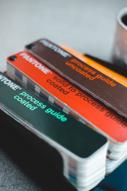
Paper ICC profiles: don’t skip this part
Paper ICC profiles are the missing link between your editing software and the printer. Many inkjet printers print fairly close by default, but it’s a guess. When you use a paper-specific ICC profile, you give the printer a map for that exact paper + ink combination.
Common real-world scenario: you use a paper that looks “off” only on your printer. The moment you install the manufacturer’s paper profile (or a tested custom one), the color shifts to match what you saw on screen.
Step-by-step: calibrate your monitor for photo editing
Calibrating your monitor is the first domino. Once your screen is stable, you can judge edits more accurately and print with fewer surprises.
1) Set up your room and monitor the same way every time
Before you even calibrate, set the baseline. Put your monitor where your light hits it consistently. Avoid strong daylight hitting the screen from the side.
If your workspace has mixed lighting (lamp + window), make a simple rule: do your editing under the same lamp settings each day. It sounds boring, but it matters more than people think.
2) Pick target settings: brightness, white point, and gamma
Use a stable target like D65 (6500K) and a known gamma so your edits translate. For most photographers, a standard target is:
- White point: D65 (around 6500K)
- Gamma: 2.2 (most common for general workflows)
- Brightness: often around 90–140 cd/m² depending on room light
Here’s the practical trick I use: if your room is dim, aim for lower brightness. If your room is bright, raise it a bit—but don’t crank it to “sunlight.” That’s how prints end up too dark.
3) Run the calibration with your chosen profile mode
Use the calibration software that came with your device. Follow the on-screen prompts, and make sure the sensor is placed correctly.
When calibration finishes, check these outcomes:
- Does the software report a good accuracy/quality result?
- Did it change brightness and white balance in a way that feels natural?
- Are you seeing less “flicker” or weird color banding?
In my experience, if the calibration result looks “too aggressive,” something else is wrong—often the room light or the monitor’s own picture mode.
4) Confirm your monitor profile is active
A profile that isn’t active is the same as no profile. After calibration, your system should switch to the new ICC profile automatically.
Check your OS display settings (or the calibration tool’s status page). Also restart your editing apps if they were open during calibration.
5) Calibrate on a schedule you’ll actually keep
In 2026, plan to recalibrate regularly, not “whenever you remember.” For many setups, every 2–4 weeks is safe if you print often. If you’re a casual print maker, monthly can still work, but don’t stretch it too far.
OLED panels can drift differently than older LCD screens. If your prints start slowly changing (skin tone warmer, blacks losing punch), recalibrate sooner.
Color-managed editing: how to keep software from messing up your colors
Your editing settings decide whether your work stays consistent from screen to print. The goal is simple: keep your file in the right color space, and let your software use the correct profiles.
What color space should your files use?
Color space is the “range” a file can represent. Most photographers use sRGB for web and Adobe RGB (or a wide gamut working space) for editing with a color-managed workflow.
If you’re printing, a common approach is to edit in a wide working space and convert at print time using printer/paper profiles. If your print app doesn’t support ICC-based conversions, you’ll need to follow its rules carefully.
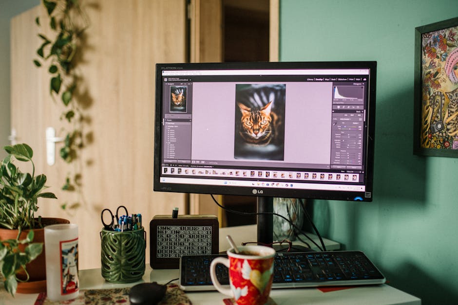
Lightroom and Photoshop: practical guidance for printing
Lightroom’s print module and Photoshop’s print workflow can produce different results if you don’t set them up right. In my setup, I treat them differently:
- Lightroom: great for quick, repeatable prints when the printer dialog and ICC options are set correctly.
- Photoshop: better for custom proofing, when I want full control over conversion and output.
If you want consistency, pick one workflow and stick to it for a while. Switching mid-stream is one of those “small choices” that leads to confusing results.
Soft proofing: see the print before you waste paper
Soft proofing uses the printer/paper profile to preview how your image will look when printed. It’s not perfect, but it’s far better than printing blindly.
Try this for a stubborn photo (like one with bright greens or deep shadows). If the proof preview shows clipping, you’ll know to adjust before you print.
Printing that matches: the end-to-end workflow
Printing consistency is a chain—break any link and you’ll see color shifts. Here’s an end-to-end workflow you can follow.
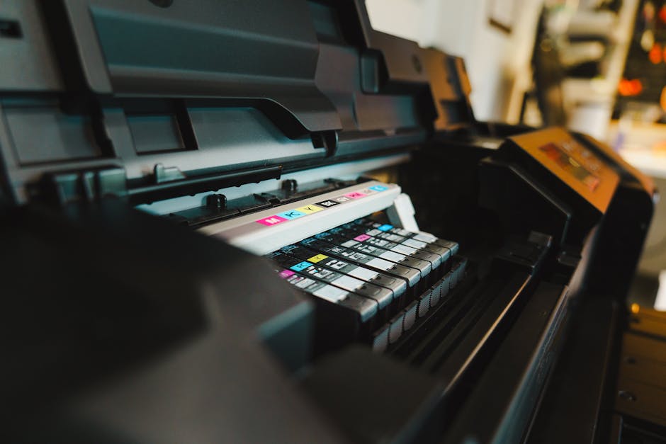
1) Start with the right printer mode (turn off wrong “color correction”)
Printer drivers often have options like “Photo,” “Vivid,” or “Automatic.” Those can fight your ICC profile and editing decisions.
My strong recommendation: when using ICC profiles for color management, turn off the printer’s extra color tweaks. Let the color management do its job.
2) Use the correct paper setting and paper ICC profile
Pick the exact paper type in the printer dialog. If the printer expects “Premium Luster” but you’re printing on “Matte Fine Art,” the inks hit differently and your colors drift.
Then apply the correct ICC profile in your print path. If your print dialog asks for ICC profile choice, use that paper’s recommended profile.
3) Choose the right rendering intent
Rendering intent is how colors outside the printer’s range get handled. For photos, you’ll usually see these choices:
- Perceptual: gentler overall mapping, often safer for photos with many colors.
- Relative Colorimetric: keeps in-gamut colors closer, can be harsher with out-of-gamut highlights.
- Saturation: more for charts and graphics than photo realism.
I use perceptual when my first proof shows weird clipping. It often restores a more natural look.
4) Make small test prints, not big “hope prints”
Test prints are cheaper than reprints. If you’re dialing in a new paper, print at least one small proof first—like a 4×6 or a 8×10—then adjust.
For fine art prints, I’ll also test one shadow-heavy image and one bright highlight image. If those two are right, most other photos fall into place.
People also ask: calibrate monitor and print questions (quick, direct answers)
How often should I calibrate my monitor?
Calibrate every 2–4 weeks if you print regularly. If you only print a few times a year, monthly still helps. If you notice skin tones drifting or blacks getting muddy, recalibrate right away.
Do I need to calibrate if I only print at a lab?
Yes, but you can think of it as “color consistency for your edits,” not for the lab’s printer. Most labs handle their own color management. Your calibrated monitor still helps you edit accurately so the lab’s result matches your intent.
If the lab offers ICC workflow guidance, follow it. If not, ask for their recommended file settings (some want sRGB). You’ll get more repeatable results that way.
Why do my prints look different from my screen?
The most common causes are a wrong monitor profile, missing paper ICC profile, or driver color adjustments. Also check room lighting—your screen might look “neutral” to you, but it isn’t.
One quick check: compare your screen against a known reference image that you trust. If the reference looks off on screen, the monitor is the issue. If it looks right on screen but wrong on print, the printer workflow is the issue.
Is sRGB enough for printing?
sRGB can be enough for some photo labs and simple print paths. If your workflow is fully color managed and your printer accepts ICC profiles correctly, you may get better results with a wider gamut working space. For lab uploads, many labs still recommend sRGB because it prevents surprise shifts.
Can I calibrate without a hardware device?
No hardware calibration means no real measurement. You can adjust brightness and try to make things “look right,” but that’s eyeballing. Hardware calibration gives you measurable targets and a profile your software can use.
Real-world examples: what consistency looks like in practice
Here’s a case I ran into last year (and helped fix with a simple workflow change). I was editing wedding photos. Skin tones looked great on screen. Then prints went warm and a bit too soft.
The culprit wasn’t the edit. It was the paper side. I was using the correct printer paper type, but the print path wasn’t applying the paper ICC profile. Once I used the manufacturer’s profile and disabled the driver’s “color enhancement,” prints matched my screen much more closely.
Another example: landscape photos with deep greens. On screen, the greens looked vibrant. On print, they turned dull. Soft proofing showed the printer had trouble with those specific green shades. The fix was small: adjust saturation and shift greens slightly toward yellow while keeping luminance stable. Then the printer’s gamut limits stopped ruining the image.
Fast checklist: calibrate monitors and get consistent prints (no fluff)
If you only do one thing, follow this checklist before you print.
- Pick a consistent editing room lighting setup.
- Calibrate your monitor with D65 (6500K) and gamma 2.2, and set brightness to a comfortable level (often ~90–140 cd/m²).
- Confirm your monitor ICC profile is active.
- Edit with a color-managed workflow (choose sRGB for lab uploads when required).
- Use the correct printer paper ICC profile.
- Turn off driver “vivid/auto correction” features that fight ICC color management.
- Soft proof when possible, then print a small test first.
Comparison: manual “driver tweaks” vs true color-managed printing
Most people try to fix print issues by changing driver sliders. That works until it doesn’t. Here’s the difference.
| Approach | How it works | Pros | Cons |
|---|---|---|---|
| Driver tweaks (less consistent) | You adjust “Photo/Vivid/Automatic” in the printer dialog | Fast for one printer + one paper | Hard to repeat across paper types, ink changes, and different images |
| ICC-based color-managed prints | You apply paper ICC profiles and let the CMS convert properly | Repeatable results, easier debugging, better soft proof match | Needs a bit more setup (profile choice + proofing) |
My opinion: driver tweaks are fine for quick proofs or when the lab doesn’t support ICC workflows. For prints you care about, ICC profiles are the grown-up way.
Where this fits with other photography tech topics on the site
If you like tightening up your workflow, you’ll probably enjoy our other guides too. Color management isn’t just about “printing”—it’s part of a bigger system of good file handling, security, and gear choices.
- secure photo backups so you don’t lose calibrated ICC settings and proof files
- our gear review roundup on colorimeters and what to look for
- 2026 imaging news on new printer and color workflow updates
Limitations: when perfect matching isn’t realistic
Even with great calibration, you won’t get a 1:1 match in every situation. Screens are light-emitting. Prints are reflective. Your viewing environment matters. Glossy paper reflects light differently than matte paper.
If you’re sending prints to clients, plan for the human factor. Ask what viewing lighting they’ll use. For home prints, include a quick note about how to view glossy prints (from the side glare-free if possible).
Also, if your printer driver is outdated or your paper profile is missing, you may not fully fix the mismatch. In that case, stick to one verified paper + profile combo until you can update.
Conclusion: calibrate once, proof smart, and you’ll stop fighting your prints
If your monitor is calibrated and your print workflow is color-managed, you’ll get consistent prints most of the time—and when it’s off, you’ll know why. Start with monitor calibration, then use the right paper ICC profiles, disable driver color “enhancements,” and make small test prints before you run a full set.
My takeaway after years of printing and re-printing: consistency comes from repeatable steps, not from guessing. Once you build that repeatable chain, color management turns from a headache into a workflow you trust.
Action you can take today: Calibrate your monitor this week, save the ICC profile name, install your paper ICC profile, and print one small proof from an image with both deep shadows and bright highlights. That one test will tell you where the problem lives—screen, conversion, or printer.